

COSY VIBES: 5 things that contribute to a cosier design
COSY VIBES: 5 things that contribute to a cosier design
The second issue of the Petronella.Art Magazine. Today is about to get REEEAAAALLLY COSY!
Hello 👋🏼
Hope you’re having a restful and cosy weekend!
P.S. You can choose to read this article on the web here.
Instead of sharing the new June embroidery pattern right away, I want to dive a bit deeper into the Slow Life Dream Collection that I shared with you a few days ago…
More specifically, reflections on what it is that makes them evoke soothing emotions (thank you to everyone who sent me messages!), as well as how I have intentionally designed them that way.
WHAT’s cosy to you?
The default when designing is to first think of objects that represent a certain mood such as coffee, books, art supplies, soft blankets, pillows, plants and more.
But it isn’t just the actual objects that you add to a scene that contribute to the overall atmosphere and “vibe”.
It can also be things like:
Space (how far or close objects are placed in relation to each other, smaller spaces tend to transfer a more cosy vibe than larger ones)
Colour scheme (or level of shadows if you’re doing a black and white scene… more shadows, more cosy)
Textures (To include blankets, pillows, curtains, carpets… anything that is textured in real life. More textures, more cosy.)
Shapes (Rounded shapes tend to feel more soothing than sharp harsh lines…)
Light (Depending on where the light comes from, it will travel differently throughout the room… Early morning or late at night has the cosiest effect.)
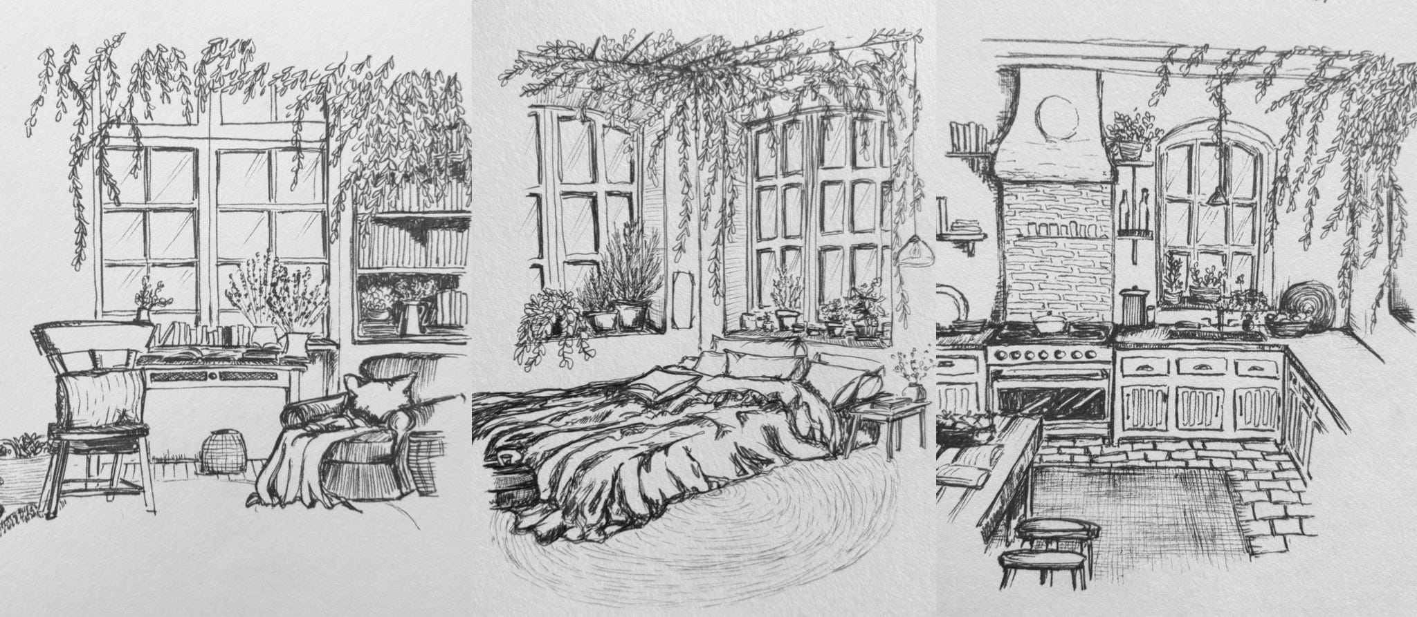
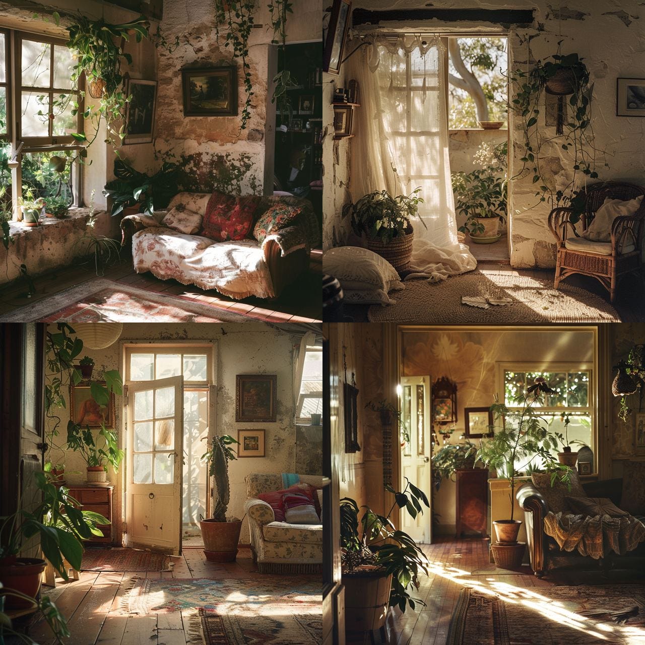
An example I did for this article;
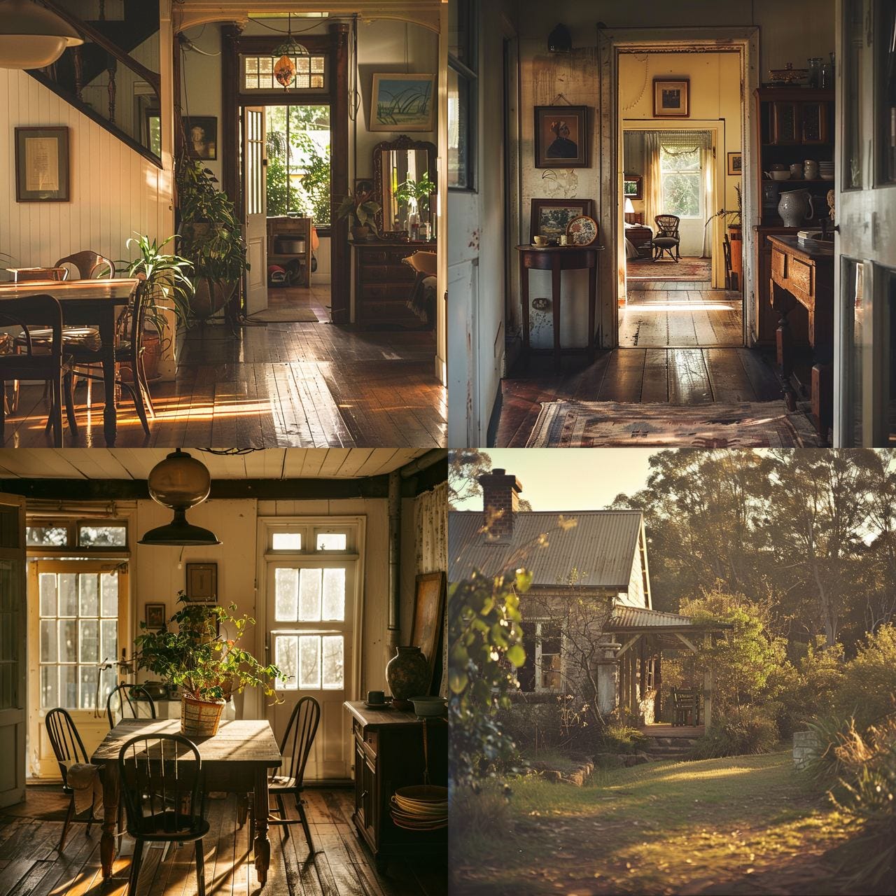
Below is a great visual example of four images that I generated by inserting “cosy prompts” into an Ai.
I literally went through the list above and typed something like: “Space; Intimate, Colour scheme; Warm and Neutral, Texture; Old farmhouse, Shapes; Soft, Light; Dawn” as well as adding the various objects that represent cosiness like: Greenery, carpets and textiles….
The most astonishing aspect of the images (in my opinion) is how the system managed to convey the “travelling of light” and textures. When I first saw them I just wanted to squeak YUM TAKE ME THERE haha, what about you?
Another concrete example that I played with this morning as I made my daily sketch was the placement of objects.
Ps. The drawing is of a new piece of furniture I thrifted yesterday… I needed something in the eating room that can store my art supplies away from little fingers, while still being close enough for me to sprinkle in some creativity in the naps and gaps of motherhood.
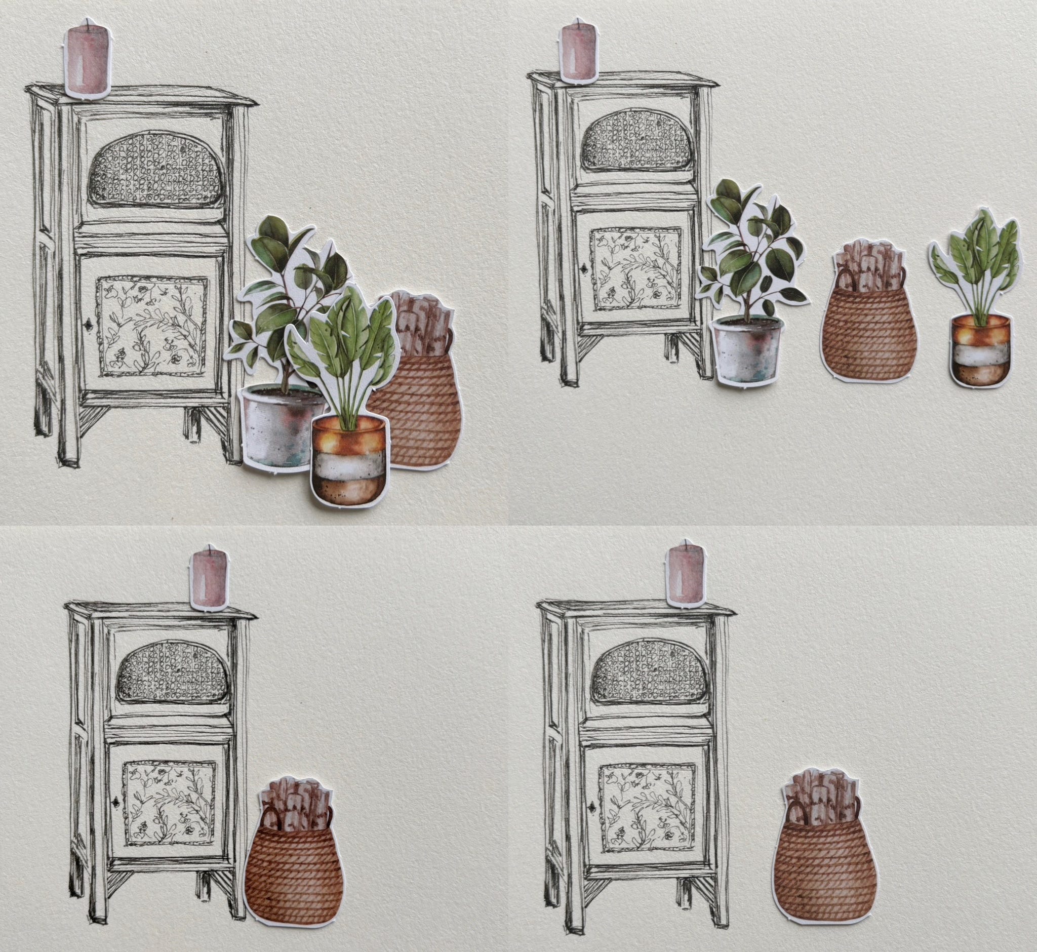
Image explanations:
If you put the pots evenly spread out on a row next to each other (as the top right), the image will feel flat and empty whereas if you “bundle them up” closely together, ideally slightly overlapping each other, you’ll immediately transfer a more intimate and cosy vibe (top left).
The example with the basket is an even simpler version, where literally placing a woven basket a little bit of a distance from a piece of furniture, vs. closer to it (minimising the space) has a huge impact on the overall vibe too. Isn’t it fascinating?!
When working in black and white, more is more
Black and white can feel very harsh, there isn’t anything inherently cosy with it at all. BUT, that doesn’t mean you can’t make it cosy (like the example of my illustrations above). When conveying a more cosy vibe you’d want to think of more is more.
In other words, reducing a design to simpler and “cleaner” lines takes off the unstructured and “randomness” of layered lines, which makes it more cosy.
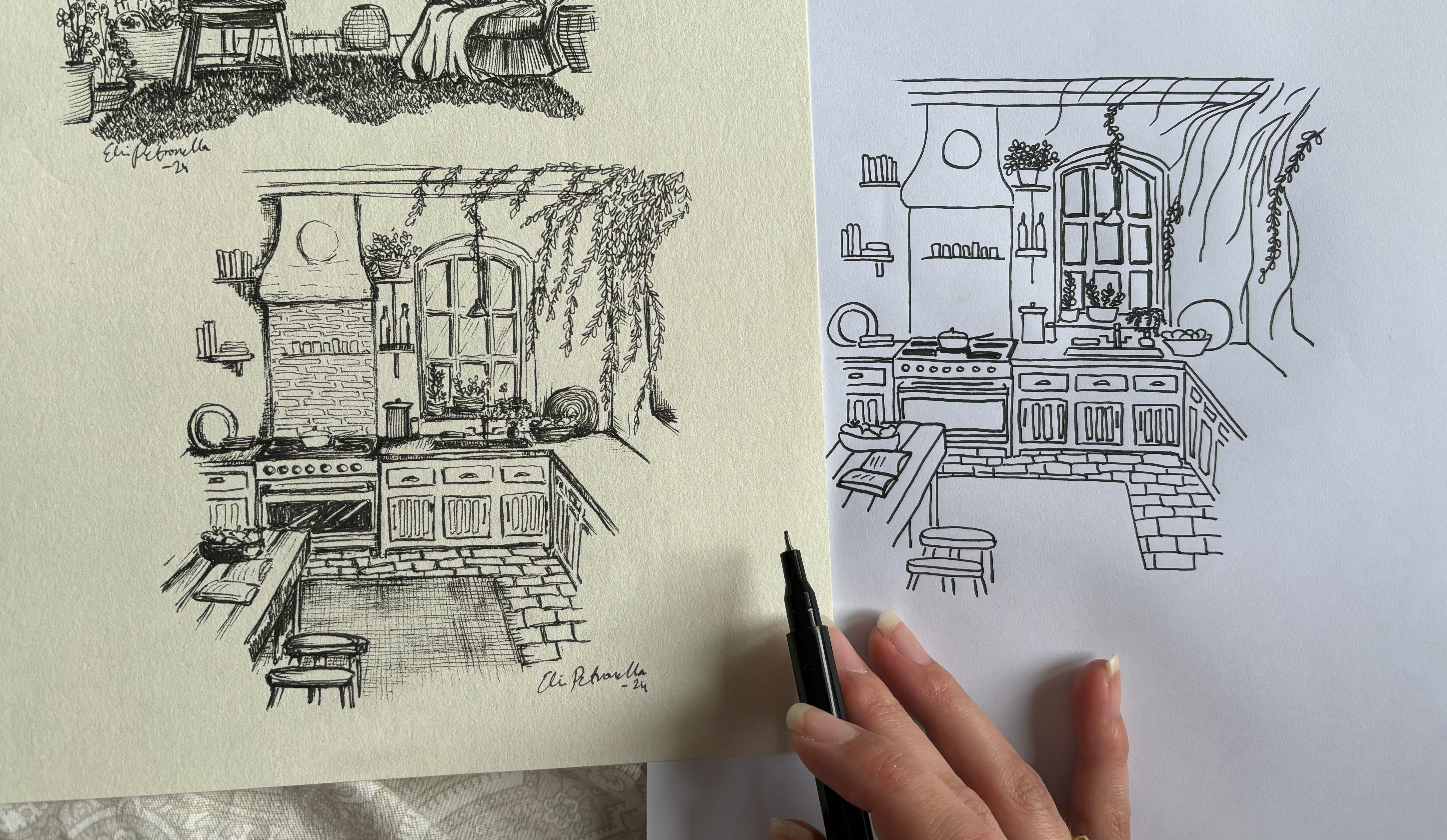
The image where you can see the embroidery pattern vs. the illustration is an excellent example to show the stark difference, see below:
Below is short video snippet of adding some extra “unnecessary” lines to the carpet only to enhance the textural effect.
So, how to create a cosy space in embroidery?
Firstly, you’re in luck because embroidery in itself represents HYGGE in every way. Hygge is in Scandinavia an inherent part of the culture and doesn’t only include cosy “things” but also hobbies and activities that feel cosy to do. For example embroidery, drawing or playing cards with your family late at night.
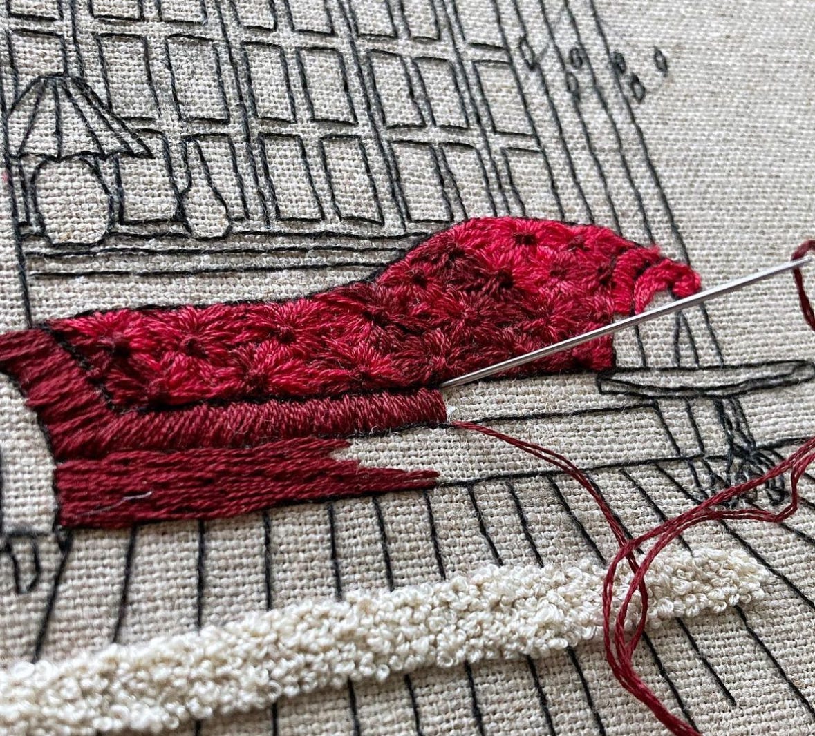
Throughout my embroidery career I’ve always referred to my embroideries as “touchable drawings”, which means the main element you’d focus on for a cosy embroidery design are the textures.
This can be achieved by varying the types of stitches and especially the direction of stitches such as in the example below.
The red sofa, quite Victorian in style, gets its depth from varying the direction of the stitches (I stitch in the direction I would’ve drawn with a pencil…), as well as incorporating some French knots for added 3D effect (see the carpet). Lastly, I used a variated floss as opposed to a monochrome red to add the “random” element for more vibe.
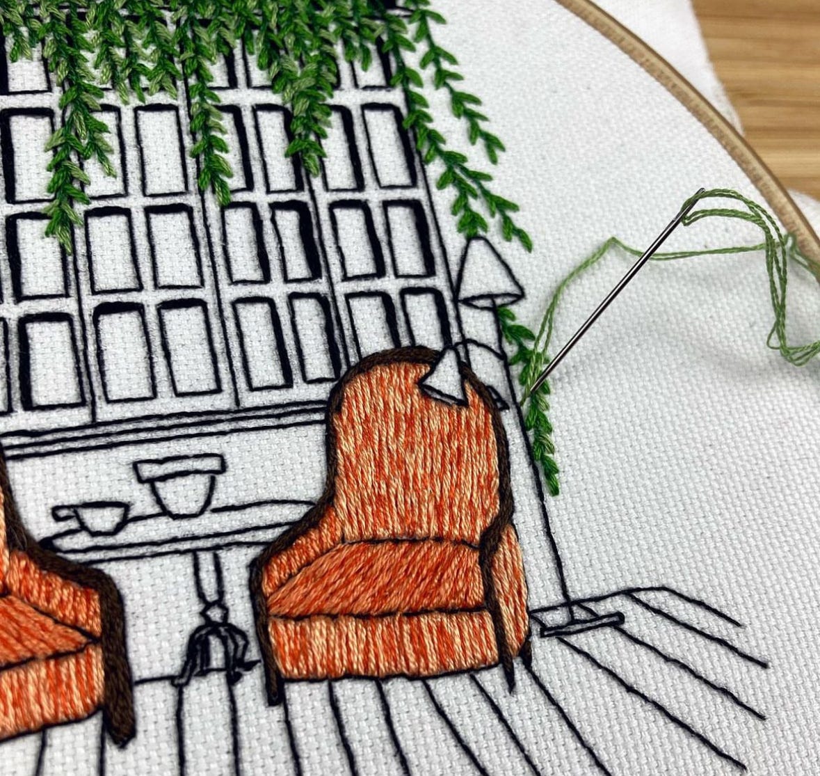
Here’s another example from my Interior Embroidery Masterclass, which is very related to the illustration style in the Slow Life Dream collection (Yes I LOVE greenery hanging from the roof or above windows…. there’s something magical about it).
Ironically, the least cosy on the design below is the white background fabric… If I were to re-stitch it I’d choose the raw linen-cotton blend that I used in the previous example.
Thank you so much for reading! I really hope you enjoyed today’s cosy vibes!
Elin, xx
P.S.
If you loved this issue and would like to access the BONUS Slow Life Dream illustrations + embroidery patterns…
You presence here is hugely appreciated, I can’t wait to see where this grows in the future <3
Further reading:
Direct link to the first issue with the Slow Life Dream illustrations (Including the downloadable PDFs)
Direct link to check out the Interior Design Embroidery Course
Which countries do you think have the coziest bars and homes? And by cozy, I actually mean the Dutch word gezellig, which is like cozy but also takes the convivial energy of the people into account. And by Dutch word, I actually mean Flemish word because Belgians mastered it, haha. Anyway, to me, Budapest and Krakow have some of the most gesellig bars (much due to the esthetic), cities throughout Spain have the most gesellig terraces (due to the people), and Hanoi has the most gezellig streets due to the energy and the esthetic. As for homes, they can be gezellig anywhere. But the least gezellig homes, bars, and restaurants I have come across are in Canada and the States because they feel like businesses and investments even when the aesthetic is eye-catching. Maybe it’s because magic in art and design is broken when the focus is money.
Wow that red couch feels like it’s in 3D amazing!!! You’re an exceptional artist!